 Plate 01
Continuous fields
Some phenomena don't have edges — and forcing them into polygons quietly breaks the model.
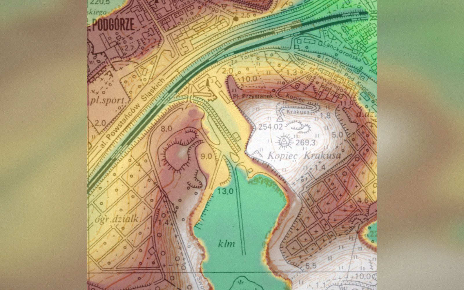
Elevation has a value at every point, which suits a grid of cells rather than a boundary drawn around a class.
Photo: Shaded-relief elevation model, Krakus Mound, Kraków · Wikimedia Commons
The difference a grid makes
Temperature at any point on the ground doesn't stop and restart at a boundary drawn by a cartographer. It has a value everywhere, varying smoothly across space. Elevation is the same. So are air pressure, soil moisture, and radiation dose. These are continuous fields: phenomena for which every location carries a value, not just the locations where someone happened to measure.
A polygon model handles them badly. A choropleth of average monthly temperature by administrative region implies that temperature is uniform inside each region and steps abruptly at its border — both claims are false. The polygon edges are cartographic fictions imposed on something that recognises no edges at all. The data can survive this treatment, but the model lies about its nature, and that lie propagates into any analysis that follows.
A raster grid is the natural structure for a continuous field. Each cell holds a single value, and the cells tile the full extent without gaps. The resolution — the ground distance each cell represents — determines how much spatial variation the grid can express. A coarser grid smears detail; a finer one demands more storage and more source data to justify it. Neither is wrong in principle; resolution is a modelling decision, not a fact about the world, and picking the wrong level of detail for a given purpose is a generalisation error like any other.
Representing a continuous field as a grid still requires interpolation wherever a value is inferred between measurements. Digital elevation models, for instance, are constructed from point surveys — LiDAR returns, photogrammetric points, GPS transects — and the grid is generated by estimating values between those observations. The interpolation method shapes the result: inverse-distance weighting, kriging, and spline fitting each make different assumptions about how the field behaves locally, and each produces a visibly different surface from the same raw points.
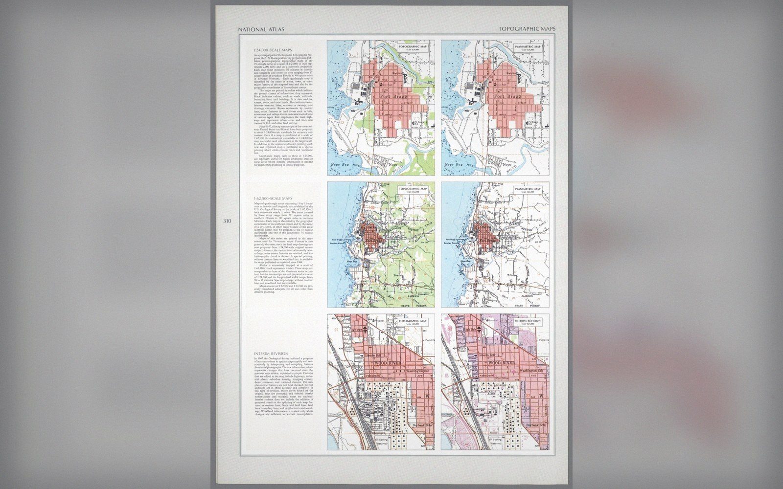 Plate 2
The same ground published twice, with contours and without. What a sheet leaves out is a decision about its purpose.
Photo: Topographic and planimetric sheets, Fort Bragg · Wikimedia Commons
Rendering adds another layer of decisions. A grid can be displayed as a classified colour ramp, where the cartographer bins values into ranges, or as a smooth gradient, where colour varies continuously. The classified version is easier to read but implies discrete categories that don't exist. The smooth version is truer to the data but harder to decode precisely. Neither the grid structure nor the rendering is invisible to the reader, which means both choices carry rhetorical weight.

The practical test is simple: ask whether the phenomenon has a value at an arbitrary location, or only at the locations that were collected. If the former, a grid — or at minimum a continuous interpolated surface — is the right representation. Polygons should describe things that are genuinely bounded. The ground temperature on a Tuesday morning is not one of them.
Also in Vector & Raster