 Plate 01
Equal interval and quantile
One divides the data range, the other divides the count. They rarely agree, and the gap between them is where most choropleth mistakes live.
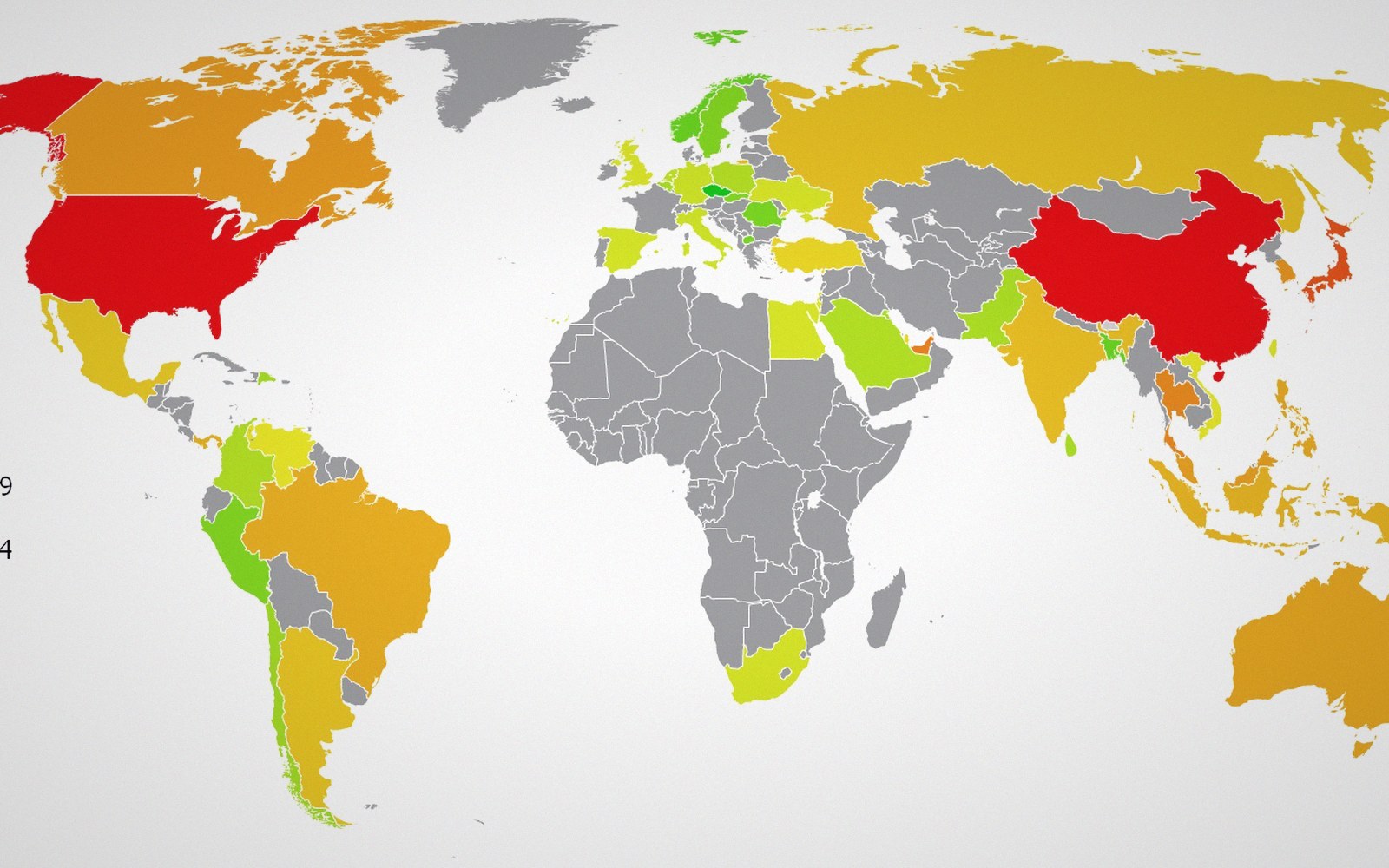
Equal interval divides the range; quantile divides the count. The same numbers rarely produce the same map.
Photo: Countries by Skyscrapers Map · Wikimedia Commons
Two rules, two different answers
Take a dataset of income by district: one very poor area, a dense cluster of middling districts, and a handful of wealthy outliers at the top. Classify it with equal-interval breaks and you get classes of identical width — say, brackets of twenty thousand each — whether or not any data actually falls there. Classify it with quantiles and you get classes of identical size — the same number of districts per class — regardless of how spread out the values within each class happen to be.
The same dataset, the same palette, and the two maps look nothing alike. That is not a design problem; it is a signal that classification is itself an interpretive act.
Equal interval is the more legible method in a specific sense: readers can reconstruct the break points from the legend without arithmetic, because the intervals are regular. A district coloured in the third class out of five genuinely sits in the middle fifth of the value range. The legend means what a scale bar promises it means. That transparency has real value when communicating magnitude — when you need the reader to know not just the rank of a place but roughly where it sits in absolute terms.
The cost is hollow classes. When data clusters in one part of the range, most districts pile into one or two classes and the others are almost empty. The map loses discrimination precisely where the data is densest. A heavy right skew — common in income, population density, property values, disease rates — will push nearly everything into the lowest class and leave the upper ones nearly blank. The visual impression is that almost everywhere is the same, with a few alarming exceptions at the top. That may be a truthful summary, or it may simply be that equal interval was the wrong choice.
 Plate 2
A surveyor and a total station. The numbers a map is drawn from begin here, not on the screen.
Photo: Ferhat Kocakaya / Pexels
What quantile preserves and what it hides
Quantile classification fixes the emptiness problem by construction. Every class holds the same number of observations, so every colour in the legend appears roughly equally on the map. Variation is spread visually even where the underlying data varies very little. A district ranked just below the median sits in a different class from one ranked just above it — and those two districts may, in practice, be almost identical in value. The break falls where the count dictates, not where the data changes meaningfully.
This creates its own distortions. Where data is tightly clustered, quantile breaks will separate near-identical values into different classes. The reader sees contrast the data does not really contain. Two stories, one dataset is exactly the risk: a quantile map of a fairly uniform region will look as variegated as a quantile map of a dramatically unequal one, because both will produce full-spectrum choropleth output regardless of spread. The method reveals rank order reliably, but conceals the width of each class — which is why quantile legends, honestly drawn, should show the actual break values rather than just the class numbers.
Both methods also interact with the number of classes chosen. More classes give finer discrimination with quantiles and finer resolution of the range with equal interval, but beyond about five or six classes the eye struggles with the legend regardless of the classification scheme.
Choosing between them
The right question is not which method is more accurate but which question the map is answering. Equal interval suits data with roughly uniform distribution or data where absolute magnitude matters — where you want the reader to know that this district really is in the top third of the scale. Quantile suits data whose rank order is the story, or where visibility across a skewed distribution is needed and you accept that each class represents equal frequency, not equal range.
Hybrid methods exist — natural breaks, standard deviation — and they serve different assumptions again. But before reaching for them, the prior question stands: does this map need to show where in the range a place sits, or where in the rank it sits? That is the fork, and equal interval and quantile sit on opposite sides of it. Knowing which side you are on, and labelling the legend so the reader can tell, is most of what responsible choropleth classification requires.
Also in Classification