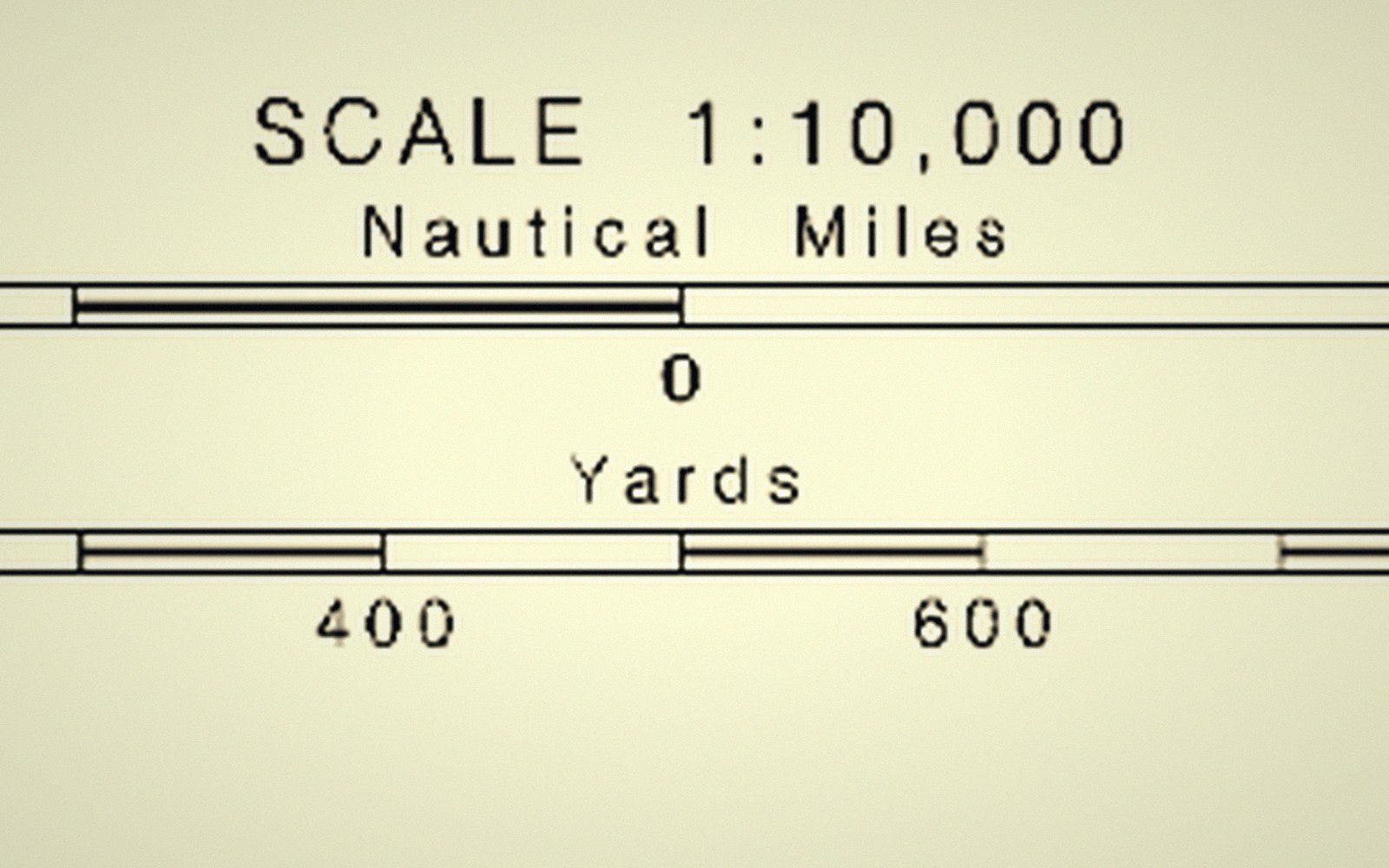
 Plate 01
What a scale bar promises
A scale bar looks like a guarantee. On most projections, it is a local truth at best.
A scale bar promises one ratio. On most projections that ratio holds only along particular lines.
Photo: Scale from NOAA Chart 13272 · Wikimedia Commons
The implied contract
Place a scale bar on a map and readers read it as a universal converter: lift any distance off the sheet, hold it against the bar, and trust the number. That assumption is reasonable on a large-scale plan of a city block. On anything smaller — a country, a continent, the whole world — it is quietly wrong, and the scale bar carries none of the caveats that would explain why.
The problem is not measurement error. It is geometry. When a curved surface is forced flat, distances are preserved only where the projection designer chose to preserve them. Everywhere else, the ground is either stretched or compressed relative to the sheet, and the ratio between the two shifts continuously across the map. A single bar, printed once in a corner, cannot represent a ratio that is never the same twice.
Where the bar tells the truth
Every projection has what are called standard lines — parallels, meridians, or secant circles along which the scale factor is exactly 1.0: the map distance matches the globe distance at the stated representative fraction. The scale bar is accurate there, and only there.
On a conic projection such as the Lambert Conformal Conic, the standard parallels might run through the middle of a mapped country. Along those lines, the bar is honest. North of the upper parallel and south of the lower one, the map is expanded; between them, slightly compressed. A reader in the north of the map measuring a road against the scale bar will underestimate its length. How much depends on how far they have drifted from the standard parallels and how wide the mapped region is.
 Plate 2
A surveyor and a total station. The numbers a map is drawn from begin here, not on the screen.
Photo: Ferhat Kocakaya / Pexels
Cylindrical projections offer a similar story. The Mercator — still the default backdrop for many web maps — has a standard line at the equator. Its scale factor grows toward the poles as the famous trigonometric function of latitude, reaching about 1.41 at 45° North or South and climbing steeply beyond. The scale bar placed on a Mercator world map is telling the truth about one thin band straddling the equator. For Greenland versus Spain, it is saying almost nothing useful at all. The conformal, equal-area and equidistant families each distort distance in different ways, but none of them make a single scale bar honest across an entire sheet.
Equal-area projections, which trade angular fidelity for areal fidelity, produce compressions in one direction compensated by stretching in another. Distances along a particular azimuth might be correct; along the perpendicular they are wrong. Scale in these projections is direction-dependent as well as position-dependent. One bar captures neither variation.
What cartographers do about it
The traditional cartographic response is to quote the scale as a representative fraction — say, 1:1 000 000 — and to note in the map's metadata or marginalia which standard lines apply. On a small-scale thematic map where readers need only approximate distances, this is usually enough: nobody expects to navigate from a political atlas. On a map where measured distance is part of the work — engineering, logistics, military planning — the correct response is to choose a projection and a scale that keep the scale factor within an acceptable tolerance across the area of interest, and to say so. Alternatively, graticule divisions (the degree grid) can stand in for a scale bar: because degrees of latitude are nearly constant in length, a spacing of one degree of latitude gives a consistent distance indicator regardless of the projection.
On web maps with continuous zoom, the scale bar is updated dynamically at the map centre, which is the only point where it can honestly claim to apply. The honest bar in that context is not a lie — it is just narrowly local, and the map gives no visual signal that its truth is local.
The scale bar is useful furniture. But it is a promise about a point, not a property of the sheet. A reader who knows that will measure more carefully; a cartographer who knows it will pick their projection to bring that point — and its promise — as close to the map's purpose as they can.
Also in Map Furniture