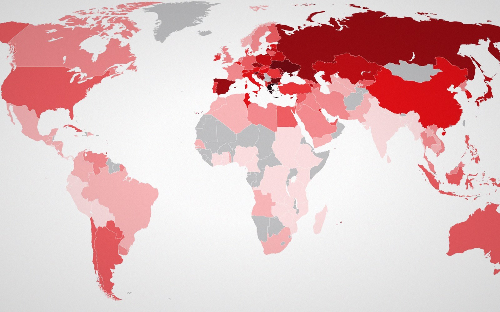
 Plate 01
Two stories, one dataset
Classify the same numbers differently and the map reverses its argument. The method is not a footnote — it is the claim.
One dataset, one map. The classification decides which places the reader will call high.
Photo: World map of cigarettes smoked per adult per year · Wikimedia Commons
The split that changes everything
Take a county-level dataset of, say, unemployment rates. Run it through equal-interval classification and the map might show most counties coded dark, clustering in the upper portion of a range that stretches from 3% to 18%. Run the same numbers through quantile classification and the map redistributes those colours so each class holds the same count of counties — and suddenly the pattern looks benign, the darks spread evenly, the crisis dissolves. Neither map has altered a single input figure. The classification has done the arguing for them.
This is not a marginal edge case. Equal interval and quantile are the two defaults most mapping software reaches for, and they disagree routinely on skewed distributions — which most real-world socioeconomic data are. Where the bulk of values pile up at the low end and a tail stretches right, equal interval hands most colours to that thin tail and leaves the crowded low end sharing one shade. Quantile ignores the actual distances between values and pretends the distribution is uniform. Both distortions are real; neither is labelled as a distortion.
Natural breaks (Jenks optimisation) cuts differently again: it finds the groupings where within-class variance is smallest, which often produces class boundaries at statistically defensible points but at numbers that are hard for a reader to remember or interpret — boundaries like 7.34% rather than 7%. Standard deviation classification makes sense only when the data are roughly normal, and announces deviations from a mean rather than raw magnitudes. Each method tells a different story, and each story can be made to sound like the only reasonable one.
The obligation that follows
The classification method belongs in the legend, stated explicitly, not buried in a methodology appendix. A legend that reads only "Unemployment rate (%)" with five colour swatches has withheld the interpretive key. Readers — including sophisticated ones — will read the colour as encoding relative severity without knowing whether that severity is measured against the full range of values, against the count of places, or against statistical spread. They will draw conclusions the cartographer has, in effect, planted.
The number of classes compounds this. How many classes a map uses determines how fine or coarse the argument appears; a three-class map whispers, a seven-class map shouts detail it may not have earned. Fewer classes flatten the distribution; more classes reveal structure that may be noise. Both choices interact with the classification method, multiplying the space of possible maps from one dataset.
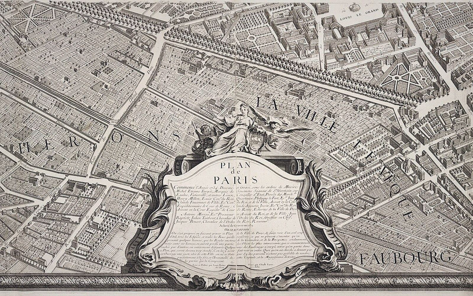 Plate 2
One sheet of the Turgot plan of Paris. The city was published as a set of sheets because no single sheet could hold it at this detail.
Photo: Turgot plan of Paris, sheet 18–19 · Norman B. Leventhal Map Center
None of this means classification is dishonest by nature. It means classification is authorial. The cartographer is making an editorial decision in the same way a journalist decides where to set a headline threshold: "hundreds dead" reads differently from "nearly a thousand." The decision must be disclosed because it is not neutral, and it cannot be neutral — collapsing a continuous distribution into a handful of colour buckets is always an act of interpretation.
What disclosure looks like in practice is simple: name the method in the legend or in a map note adjacent to it. "Five quantile classes" or "Natural breaks, five classes" costs a few characters and pays for itself immediately in intellectual honesty. Readers who notice will trust the map more; readers who don't notice carry the information subconsciously. Either way the cartographer has transferred responsibility for the interpretation to the audience, where it belongs.
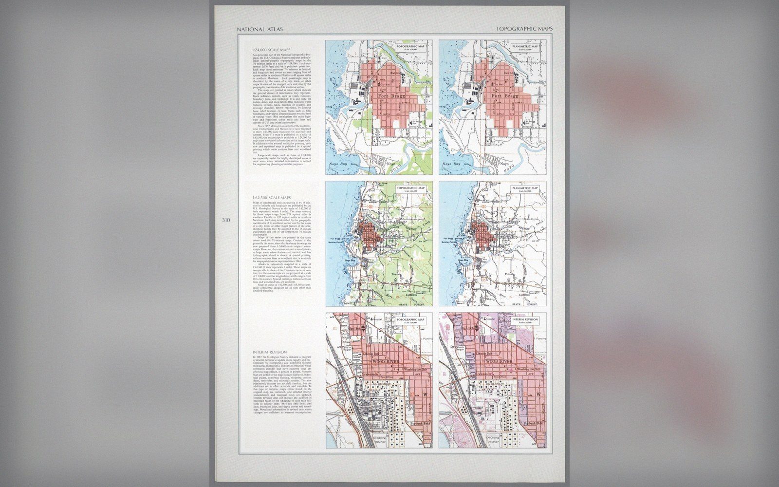
The dataset is not the map. The classification is the argument. Make it visible.
Also in Classification