 Plate 01
Counts, rates and denominators
Raw totals on a map are almost always a map of where people live. The fix is one division.
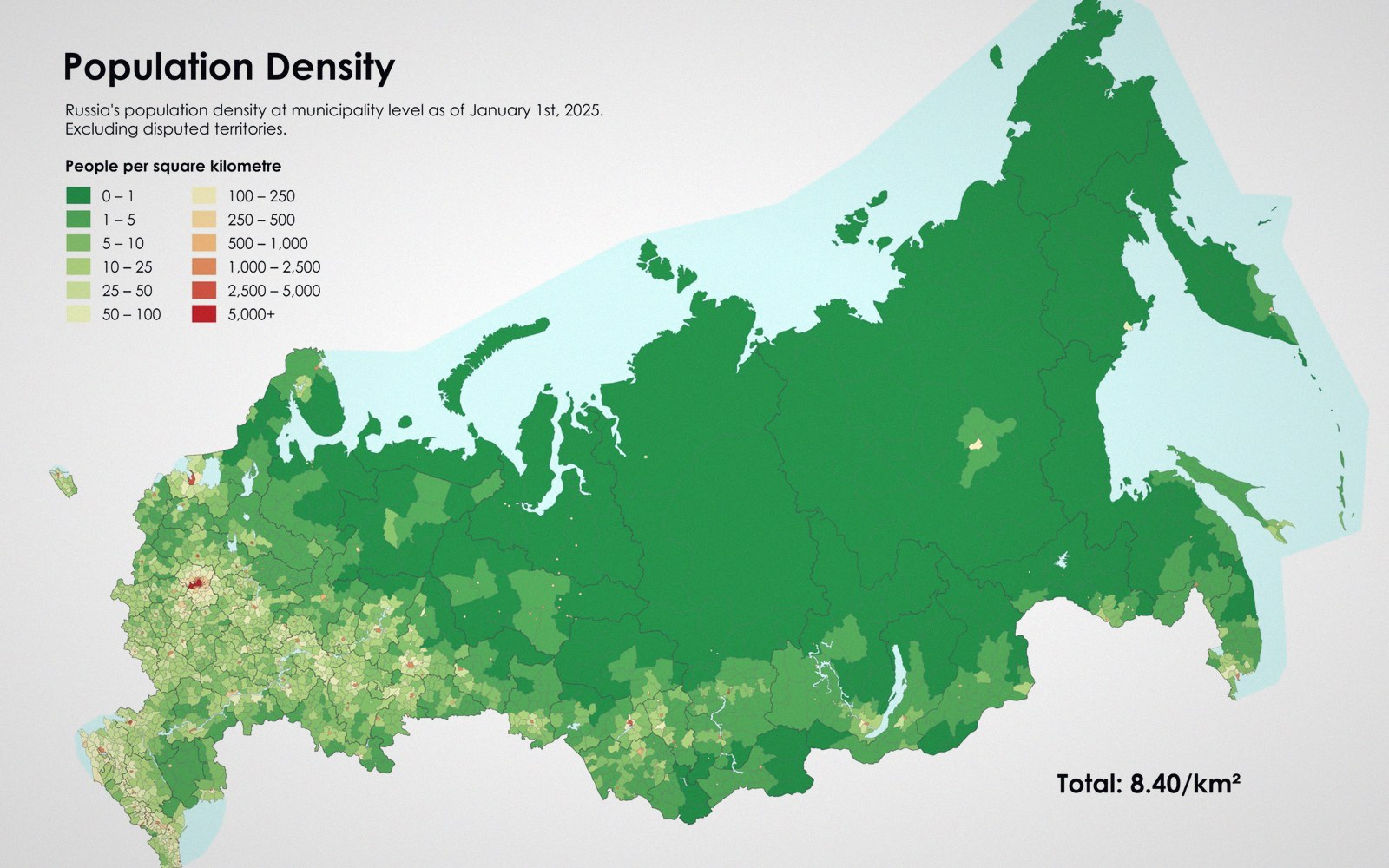
A map of counts is usually a map of population, until something is divided by area or by people.
Photo: Russia Population Density Map 2021 · Wikimedia Commons
The denominator problem
Plot the number of hospitals in each county and you have drawn, with some fidelity, a map of county population. Dense counties have more people and therefore more hospitals; sparse counties have fewer. The phenomenon you meant to show — access to healthcare — is almost entirely hidden behind the distribution of people. This is not a data error. It is a structural one, baked in the moment you chose counts as your variable.
The same trap closes around almost any count: crimes, schools, fast-food outlets, reported illnesses, Wi-Fi hotspots, road accidents. Wherever people cluster, events cluster with them. A choropleth of raw totals rewards the cartographer with a map that looks confident and informative while quietly showing almost nothing except demography.
The correction is a denominator — some quantity you divide the count by, converting it into a rate. Hospitals per hundred thousand residents. Crimes per square kilometre. Road deaths per billion vehicle-kilometres travelled. Each denominator is a different analytical question, and choosing the wrong one can mislead just as badly as ignoring the problem entirely.
Choosing the right denominator
Population is the obvious denominator, and it is right whenever what you care about is human exposure or access. Hospitals per capita, cases of a disease per hundred thousand — these normalise out the clustering of people and let the underlying spatial pattern emerge. But population is not always the right base.
Road accident rate per kilometre of road says something different from accidents per resident. If you are asking about road safety — the danger of the road itself — dividing by road length is defensible. If you are asking about personal risk to the people who live in a place, population works better. Neither is objectively correct; both are arguments. The denominator encodes your framing of the question, and that framing belongs in the map's title, legend and methodology note, not buried in a footnote.
 Plate 2
Every drawn grid is an agreement about where things sit — on tracing paper as much as on a screen.
Photo: Ksenia Chernaya / Pexels
Area is a seductive but usually wrong denominator for event data. Crimes per square kilometre of a largely uninhabited county tells you almost nothing about crime risk to the people living there; it mostly measures how rural the county is. Area normalisation makes sense for phenomena that genuinely spread across space regardless of population — soil contamination, wildfire risk, land cover change — but applying it to human events usually just reproduces the population map rather than removing it.
Temporal denominators matter too and are frequently omitted. A county with ten years of records and a county with two years of records are not comparable if your map shows total counts. Rate per year is a minimum; rate per year per population is better still where both sources of variation exist.
What the denominator hides
Choosing any single denominator also commits you to what it ignores. Dividing by total population assumes the population at risk is the whole population, which is sometimes wrong. Measles cases per hundred thousand residents makes less analytical sense than measles cases per hundred thousand unvaccinated residents — but vaccination status is rarely available at the geographic granularity of your map. The available denominator is a compromise, and a good map says so.
Small-area rates are statistically fragile in a related way. A county with four hundred residents that records two cases of something gives a rate of five per thousand — which sounds precise but is based on almost no data. The two stories, one dataset problem compounds this: classify those unstable rates with equal interval breaks and you can make the rural fringe look catastrophically affected. A rate map of sparse small areas often needs a minimum-population threshold below which units are suppressed or symbolised differently, flagging that the denominator is too small to be trusted.

None of this means counts are useless. Absolute numbers matter in planning and resource allocation: a hospital system needs to know that a county has forty thousand residents who need services, not only that the rate per capita is elevated. Show rates for analysis, counts for logistics, and resist the urge to let one serve both purposes on the same map.
Also in Classification