 Plate 01
Lettering on a sheet
Type placed carelessly destroys a map that the geometry built correctly. The rules are old because they work.
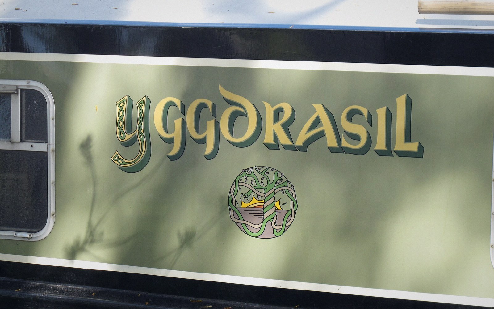
Hand lettering on a hull. The letterform is chosen for the thing it names, exactly as it is on a sheet.
Photo: Decorative lettering of a boat name · Wikimedia Commons
The logic behind the labels
Before type was set digitally, cartographers inked every name by hand or applied pressure-sensitive lettering, and the cost of a mistake was high enough to demand clear principles. Those principles have not changed because the problem has not changed: a label competes with the data it describes, and the reader must resolve the competition instantly.
Position signals category. Names of water features run along the axis of the feature — a river label curves with the channel, a bay label arches across the water body — because orientation tells the reader what kind of thing is being named before they process the words. Land-area names spread across the extent of the area at a spacing that implies "this whole region is called this". Point features take their labels to the upper-right by default, because that position is least likely to collide with adjacent symbols. These are conventions, not aesthetic choices, and breaking them without reason creates ambiguity.
Hierarchy is carried by weight, size, and case, in that order. A capital city sits above a town not because a larger font is prettier but because the reader needs to rank features at a glance. All-capitals signal a different order of thing — a country, a region, a sea — rather than a grander version of the same thing. Italic conventionally marks hydrographic features across most Western cartographic traditions. When these signals conflict or are applied inconsistently, the reader's reading slows, which is a failure of the map.
Masking and halos keep a label readable across a busy background, but they carry a cost: they occlude geometry. A white halo around river labels may hide the very junctions that give the drainage pattern its meaning. The halo size should be the minimum that maintains contrast, not a generous buffer chosen for comfort.
 Plate 2
The instrument reports angles and distances. Everything on the finished map is a computation from readings like these.
Photo: Khoiru Ummah Kendari 24 / Pexels
Spacing and kerning matter at small print sizes in ways that screen previews routinely hide. Optical adjustments between certain letter pairs — VA, AV, To — are not pedantry; at six-point type they are the difference between legibility and blur. The map is eventually seen at a specific size, and lettering must be designed for that size rather than for the comfort of the draughtsman.
Every label is a negotiation between identification and obstruction. The rules that cartographers established to manage that negotiation are worth knowing even when software handles placement automatically — because the software makes the same trade-offs, and you need to recognise when it has chosen badly.
Also in Map Furniture