 Plate 01
Simplify, smooth, displace
Three operations, three different wrongs they fix — and the wrong one ruins the map.
Drawn by hand the three operations are obvious: fewer points, easier curves, or the line moved to keep it legible.
Photo: Kaboompics / Pexels
What each one actually does
Simplification removes vertices. A coastline with ten thousand points becomes one with four hundred; the line grows coarser but stays in place. The algorithm — Douglas-Peucker is the canonical one — measures how far each intermediate point deviates from the chord between its neighbours and drops anything below a set tolerance. The shape loses detail. It does not move.
Smoothing keeps most vertices but adjusts their positions, pulling sharp angles into gentler curves by averaging coordinates with their neighbours — a Gaussian kernel, a Chaikin subdivision, any number of variants. The point count may stay roughly the same; what changes is character, not quantity. A jagged digitised contour becomes something a human hand might have drawn. Smoothing does not delete anything. It relocates.
Displacement moves a feature to prevent it coinciding with another. At 1:25 000, a river and a road running side by side can each be drawn at their true width. At 1:250 000, symbol widths demand more space than the real gap allows, so one feature is pushed aside to preserve legibility. The underlying geometry is unchanged in the source data; only the rendered position shifts, and the shift must be honest — the displacement tells the reader these two features are very close, not this road is actually here.
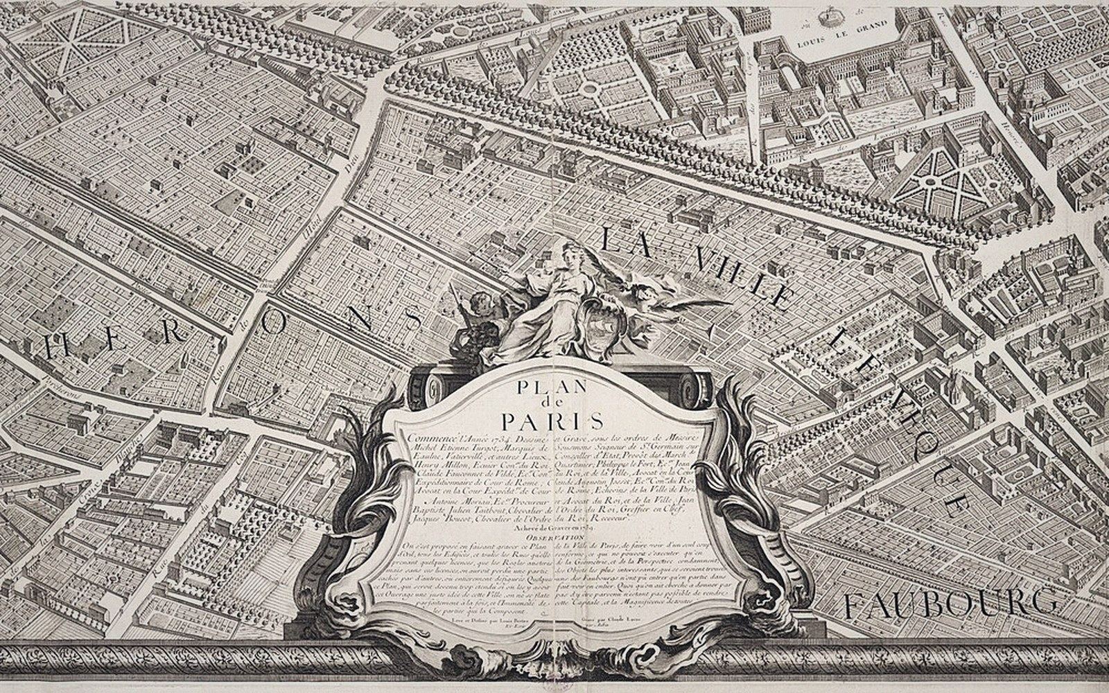
Confusing them produces specific, diagnosable failures. Applying simplification where you need displacement leaves two symbols sitting on top of each other. Applying smoothing where you need simplification leaves a file that is still enormous and slow to render. Applying displacement where you need simplification produces a map that is still cluttered with vertices, still slow, and now also geometrically dishonest. Each operation cures exactly one ill.
 Plate 2
A surveyor and a total station. The numbers a map is drawn from begin here, not on the screen.
Photo: Ferhat Kocakaya / Pexels
At any given zoom level these three are in play simultaneously, and the right sequence matters: simplify first to reduce the data, then smooth if the resulting lines are too angular, then displace where symbols compete for the same ground. Get the order wrong and later steps fight the errors of earlier ones. Generalising across zoom levels means running this sequence — or an approximation of it — at every step down the pyramid.
Also in Scale & Generalisation