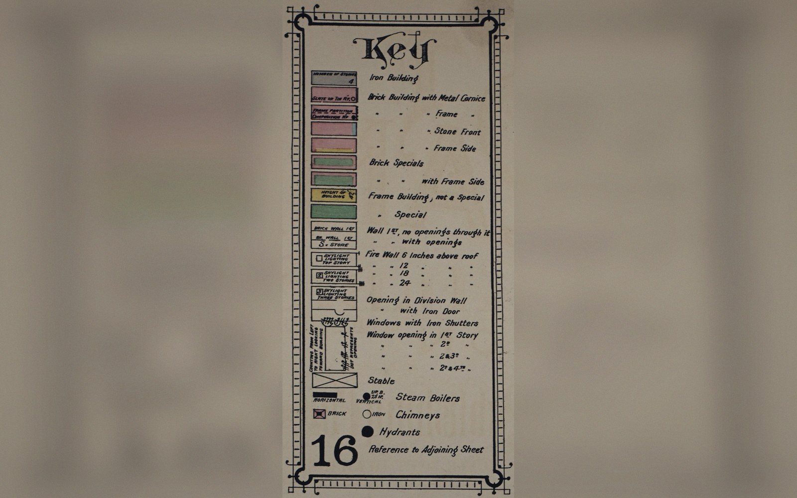
 Plate 01
Legends that need reading twice
A legend is not decoration — it is the argument. When readers have to study it to use the map, something has already failed.
Order, breaks and units are all decisions. A legend that hides them leaves the reader to infer them.
Photo: Key to a Sanborn fire insurance map, Portland, Oregon · Wikimedia Commons
The sequence nobody questions
A legend inherits defaults without thought: the software stacks classes from lowest to highest, writes a unit somewhere in the title if you are lucky, and positions the box wherever the template allows. The reader arrives with no reason to distrust any of this, which is exactly the problem.
Order is the first thing that trips people. A legend running light-to-dark reads as increasing intensity, which is fine until your colour scheme runs dark-to-light, or your classes are nominal categories that have no natural order at all. When the visual sequence on the legend contradicts what the eye expects on the map, readers spend their re-reads reconciling the two rather than reading the data.
Breaks are the second trap. Most classification schemes produce boundaries — the edges between one class and the next — and the legend must commit to where they fall and whose value they capture. Does the range "10–20" include 20, or does the next class start there? Equal-interval and quantile schemes answer this differently, and neither answers it visibly without careful labelling. A break written as "10–20, 20–30" leaves the reader to guess; "10–19.9, 20–29.9" looks fussy but resolves the ambiguity. Better still, "10 to less than 20" is plain English that needs no interpretation.
Units are the third failure mode, and the most embarrassing, because they cost almost nothing to include. A choropleth of population density means nothing if the legend lists bare numbers. Density per what — per square kilometre, per census tract, per acre? The same figure shifts its meaning entirely with the denominator. A legend that omits units forces the reader to find them in the notes, where most never look.
 Plate 2
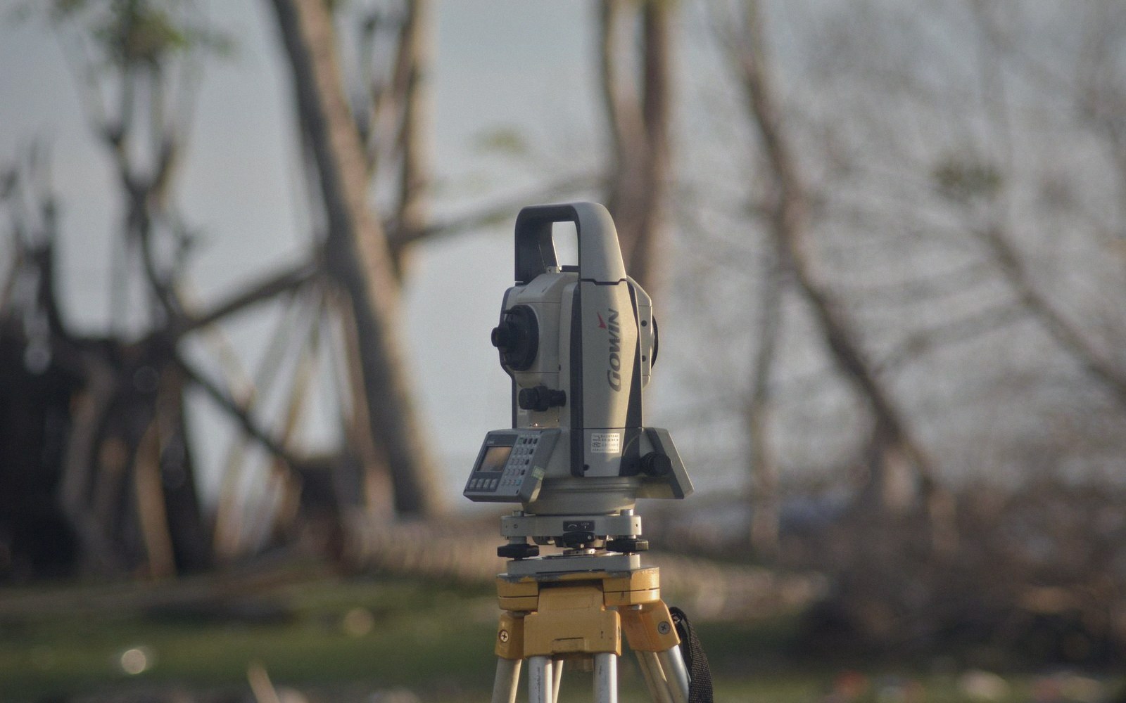
Line weight was a physical choice before it was a style rule — one nib, one width, and the hierarchy came from the set.
Photo: Thirdman / Pexels
What the legend leaves unsaid
Even a well-ordered, well-labelled legend leaves inference on the table. It rarely explains how the data were classified, or what the source date is, or whether no-data areas are masked or simply empty. These are not marginal questions: a choropleth built on two different classification schemes from the same data can support opposite readings, and the legend, silent on method, offers no warning.
The test is simple: cover the map, read the legend, and ask whether someone could interpret the sheet from the legend alone. If they cannot — if they need context buried in a caption, a methodology note, or institutional knowledge — then the legend has transferred work to the reader that belongs to the maker.
A legend that needs reading twice is not thorough. It is unfinished.
Also in Map Furniture